The 1 Powerful Strategy You Need To Design The Perfect Logo + Logo Strategy Guide


You wouldn't buy your friend a present without knowing what types of gifts they like, right? At least, I hope not... Unfortunately, designing your logo without a strategy is just like this.
When taking clients through the design process, I always use this 1 powerful strategy to make sure that their logo will clearly represent their brand to their target audience.
What's my secret recipe?
Research + Consolidate
Researching the context for your logo to identify key "visual cues" and consolidating those cues into "design rules" will allow you to craft a logo that is both true to your brand and "look" like a perfect fit to your audience.

We'll dive into both of these elements in a moment, but first, lets get one thing straight:
your logo is not your brand
It's pretty easy to get tripped up in all the design jargon but this one distinction is pretty important - your logo is not your brand.

Jeff Bezos, founder of Amazon.com, said it perfectly, "Your brand is what other people say about you when you're not in the room."
When you sit down to craft your brand, you are writing down exactly how you want your target audience to think and feel about your company. Your goal once you've defined your brand is to use everything you say, write, and design to create that perception.
Your logo is your brand's identification. It is the unique mark or image that will distinguish your company from all the others and will trigger the strongest recollection from your audience.
Now the big question: How do I make sure my logo communicates my brand correctly in a way my audience will understand? Context.
1. Research the context for your logo
The context for your logo is going to be the visual heuristics encouraged by the design aesthetic in your industry competition, complimentary industries, brands that share your values/personality, and brands that your audience already frequents.
For example: If you're selling a high-end cook book and your ideal client is affluent moms who work from home, eat only organic, and need to cook quick healthy meals you'll want to look at the following contexts:
Your Competition: organic cookbooks, 30 minute meal cookbooks, etc
Complimentary Industries: Organic grocery stores, organic farms, cooking shows, kitchen ware, gardening blogs, etc
Brands who share your value/personality: Luxury feminine brands like Kate Spade or Martha Stewart.
Brands Your Audience Frequents: Home organizing blogs, Parenting blogs/magazines, etc.
By looking at these four areas you have entered your target audience's world. The more you understand what their world looks like, the more you can look like a perfect fit and differentiate yourself appropriately.
Context really is the one thing your logo desperately needs.
Why is researching context so critical?
Did you know that online 94% of a persons first impression is design related?
That's huge! Your audience cares 94% more what you look like, than what you say (or write) on your website. In a split second your company's "look" (design aesthetic) can communicate everything or nothing to your audience.
But why is that???
Ok, confession time: I'm a huge psychology nerd! Specifically sociology.
Sociology is the study of how we behave in social groups or more basically - what makes us all the same. I'm sure you can see why, as a designer, I'd be more interested in the latter field of study.
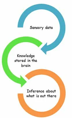
Visual heuristics (or shortcuts) is a phenomenon that you're already familiar with - It's how you "know" when a brand looks luxury, or feminine, or kid-friendly or some mix of those elements.
Here's how the power of context works:
Over the years, you've interacted with brands that have used similar visual cues to communicate that their product is for women. Your brain has stored that data and created shortcuts so that the next time you see the same mix of elements - say - the color pink, script type, and flowers - you'll assume it's feminine.
Understanding what "visual cues" can trigger the right assumptions is an incredibly powerful tool to use when communicating with your audience.
The process works like this:
By identifying the visual aesthetic that your target audience is used too by looking at the 4 contexts described above, you can create the world of design rules for communicating with your audience.
These rules can then be followed, bent, or broken depending on how your brand needs to be perceived.
Take these farming equipment logos for example:
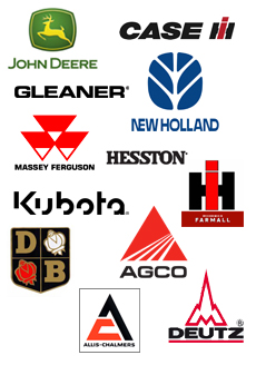
What elements do the majority have in common? Bold san-serif typeface, geometric shapes, the colors red and black.
Which logos stand out? John Deere and New Holland.
Why? These two logos follow some industry rules while bending others.
John Deere still has a sans-serif typeface, but the icon shape is softer, they are the only ones with an animal image, and the color is completely different.
New Holland also uses a sans-serif typeface, but distinguishes itself with color and the shape of it's icon.
If you were to compare these two logos to the logos found in a complimentary industry like animal-feed or crop-harvesting, you may find more similarities, but the effect is the same:
Similar enough to belong yet different enough to stand out - that's your sweet spot!
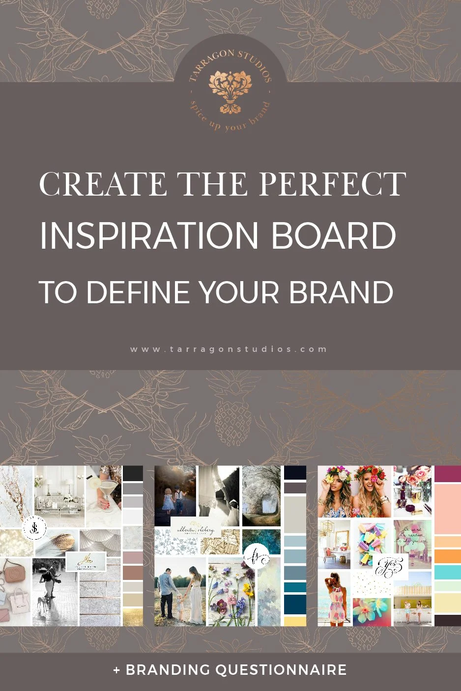
2. consolidate your research

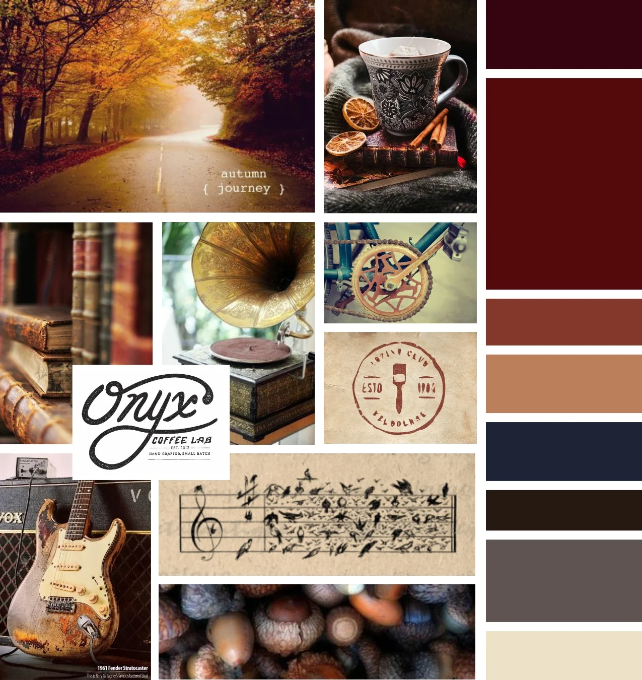

This is where your inspiration board or "mood board" comes into play.
You'll want to research the logos, brands, and lifestyles of your 4 areas of context:
your industry
complimentary industries
brands that share your values/personality
brands that your audience already frequents
You're goal is to create a large catalog of images that your target audience would recognize and relate to, as well as images that reflect your own brands personality and values.
From that large catalog you'll then pick and choose the elements that will communicate your brands key values and differentiate your brand from the others in your industry.
It's all about identifying patterns and similarities that you can use.
Pinterest is an excellent resource for this! I like to make an enormous pin board for each client, so that I can really understand what their audience will be accustom to seeing. My goal is to identify the visual "rules" of their industry and then form a plan to strategically use some rules and bend or break others.
Design is really about speaking another language. Instead of words and sounds though, you'll be communicating with shapes and color. We all understand this language to some extent, but speaking it can me more tricky.
Once you can identify the patterns in that language and what they mean to your audience, you'll be able to design an absolutely perfect logo!

What visual cues have you built
into your logo to communicate
with your audience?
Let me know in the comments!
Having trouble building strategy into your logo?
Follow the link to the right and let's talk!