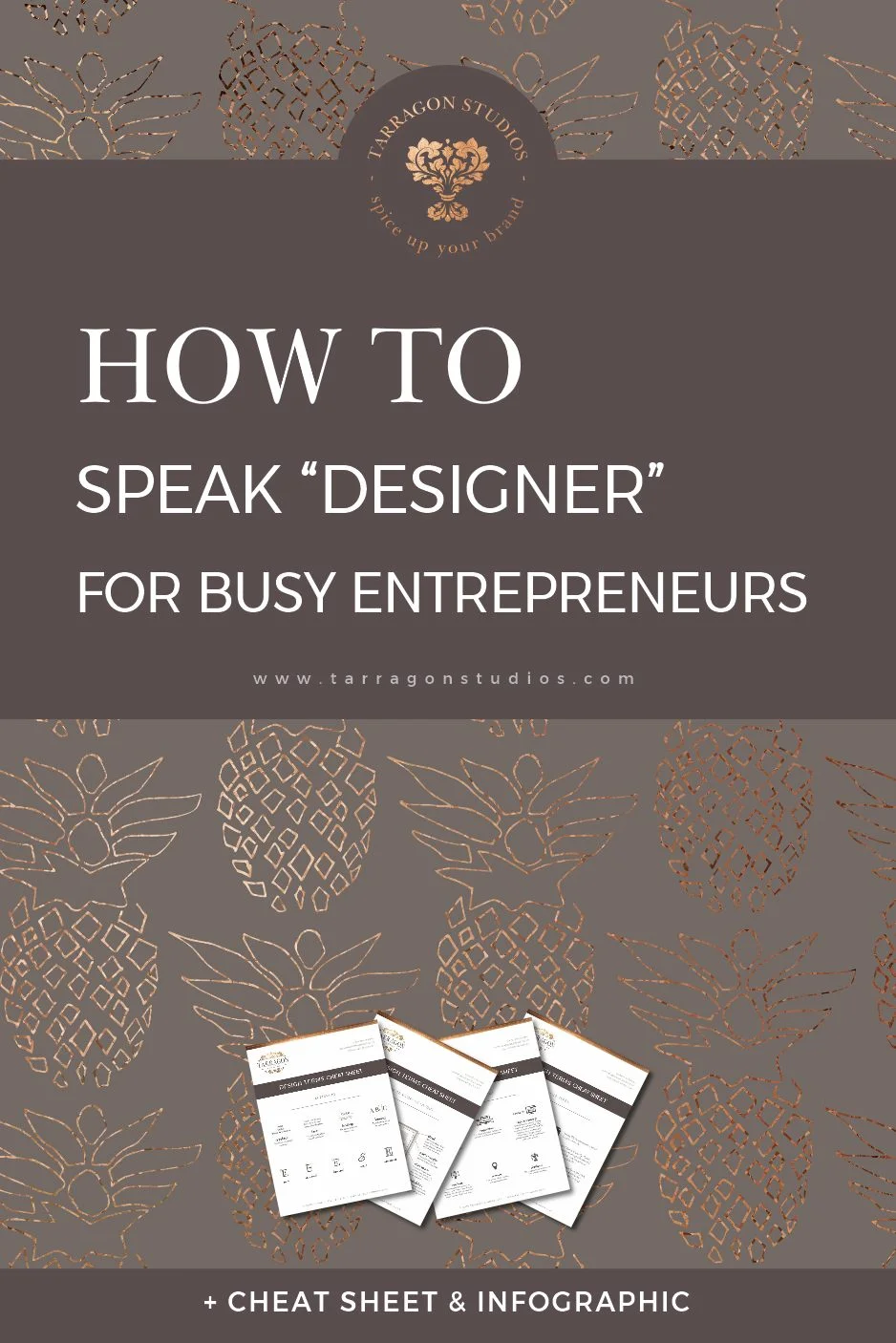
How to speak "designer" for Busy Entrepreneurs
Clear communication with your designer is the key to crafting a design that you love, but it's difficult when you don't speak the same language. They may throw around terms like "bleed limit," "kerning," "typeface" (but isn't that just a font???), or "vector" without really explaining what everything means.
Understanding a few design phrases can save you and your designer so much time. After all, having to type out something like, "please decrease the space between the letters and increase the space between the lines of text," gets old really really fast. (Especially when this request could be communicated simply, "Please decrease the kerning and increase leading.")
To improve communication between busy entrepreneurs like you and your designer, here is a little guide to get you both on the same page:


