how many times have you heard
the word “branding” thrown around?
With so much misinformation surrounding it, “branding” can seem like an abstract concept and more trouble than it’s worth - especially when all you really need is a logo, right?
Well, not quite, let’s think about branding in a more tangible way.
If you had a job interview tomorrow would you sleep-in in the morning, wear whatever you wanted, and spend your time in the waiting room playing candy-crush on your phone? Of course not!
As an individual you would never behave that way. You would research the company and have questions/answers prepared in advance. You’d discover the office dress-code and dress appropriately. You’d spend those precious moments before your interview strategizing how to communicate exactly how your unique strengths would benefit that company. How you look and what you say would all be focused on the goal of demonstrating that you’re the right person for the job.
That’s branding.
It’s the research-based aesthetic and messaging that sets your customers expectations and indicates that your business is the right one for their job.
Branding is so reliant on you, as the business owner, having a clear understanding of your company’s mission, strengths, industry, and ideal client, that I’ve had my branding clients tell me that working through the branding process helped them clarify other areas of their business plan.
So how does branding relate to design?
Design or your brands “aesthetic” is only one element of your brand. It’s the “dressing for success” you’d do as an individual on your way to that job interview. As the most visible element of your brand it gets the most attention, but that tangible aesthetic is worthless, if it isn’t backed by your company’s messaging.
Your brand aesthetic is made up of your company’s:
logo & variations
color palette
photography
ads
brochures
website layout
It’s everything you can see and interact with.
Your brand’s messaging is made up of your company’s:
competitive advantage (that thing you do best)
your industry position (how you differentiate from your competition)
your target market (the person who is most helped by your product/service)
You want to create your brand aesthetic around your company’s messaging. This is called “branding as a strategy” or “strategic branding” because, instead of drawing your logo based solely on your own preferences, now you’re using all the research you’ve done to inform your design decisions.
When your aesthetic is centered around your messaging, suddenly your designs, photography, ads, website, even the colors you choose become powerful assets to communicate why you’re the best option for your target market.
That’s the power of strategic branding.
The power of strategic
branding is in your research

how does my brand aesthetic
communicate with my audience?
How could something as simple as choosing the right font possibly endear my company to my target audience?
For better or for worse, we all make assumptions about people, products, and companies based on how they look, sound and "feel." As we grow-up, we encounter many similarities in the world around us. Our minds are excellent at storing and categorizing information and often times form "short-cuts" or "stereotypes" to allow us to access information faster. It's how you "know" when something looks "vintage," "boho," or "Classic."
Using your research to create authentic messaging for your business will lead you to a specific set of visuals for your brand aesthetic. You’ll choose your brand’s aesthetic specifically to elicit a particular response from your target audience that matches or informs how they will feel using your product or service. Your visuals should create the expectation of the experience you plan to deliver.
For example, if your brand’s messaging is all about helping women achieve the feelings of peace, happiness, and rest, you’d probably want to use imagery like a sunny day, flowers, and warm tones of yellow & blue. Just reading that description probably had you imagining relaxing outside on a sunny afternoon.
This concept of using your visuals to create a certain expectation from your audience can work in reverse too; when the expectation does not match reality. Imagine how surprised you'd be to see a man in flipflops, tank-top, and jean-shorts representing his client in a courtroom.
Unfortunately flipflops on an attorney is exactly how a mismatched brand looks to your clients - out of place and confusing - not the emotions you want to elicit from your audience. That’s why it pays to be strategic and do the research to get that aesthetic right from day 1.
Once you have a guide,
branding becomes as easy as filling in the blanks!

how to use the branding guide
There are three phases in the branding process:
Discovery (Initial gathering of resources, market research, getting all ideas down on paper, & creating that “inspiration board”)
Draft (Time to get inspired and sketch out all your logo ideas.)
Design (Put pen to paper and pull it all together, by finalizing your logo and creating your other collateral items.)
This branding guide walks you through the "discovery" phase to inform your decisions in the "draft" and "design" phases.
The questionnaire begins with a business overview to take stock of where your business currently is (or where you would like it to be). The guide will also ask you to define some short term and long term goals for your brand, so that you can create your visuals with growth in mind.
You may have to do a little research to answer questions about who your main competitors are and what makes you different in the “Industry Analysis” section. This is a crucial section to ensure that the visuals you create look different from your competition. if you don’t know what colors, shapes, typefaces, and messages are already permeating your industry, you run the risk of creating a brand that is too similar to your competition.
Next, we analyze your current (or your ideal) clients, also known as your “target audience”. It is important to answer these questions with a real person in mind. In other words, answer them for the client that is most helped by your product/service or who you enjoy working with the most.
Finally, we describe your brands aesthetic and messaging. Again think of your business as a person/friend; this will help you give more concrete answers. Think about what your business would wear, how it would speak, and where it would hang out.
Read through your answers and pull out adjectives, imagery, and emotions that stand out to you. Record these in your "keyword" section; these will be excellent keywords to use for your brand messaging.
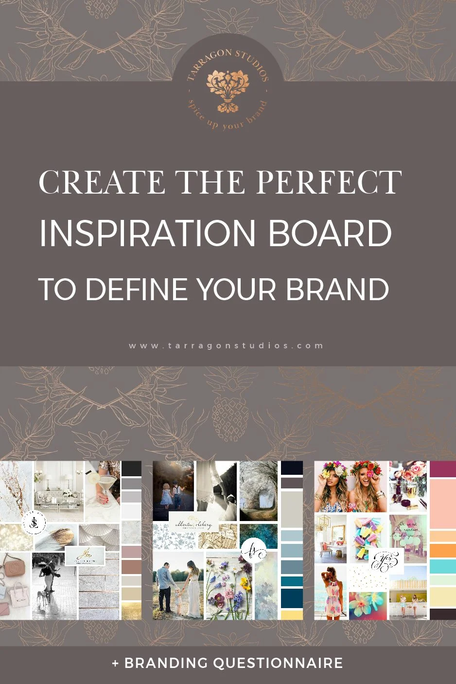
The very last step is connecting all of your brands intangible emotions and descriptive adjectives with some tangible images, by creating your “inspiration board.” This will help you double check the adjectives you’ve chosen as well - if the images that pop-up when you’re searching those adjective do not look “right” to you, then you may have the wrong adjective.
And just like that you’ve created a document that represents your industry research, your mission and direction for your business, the emotions you want customers to experience when working with you, and keywords you can use to inspire your designs!
If you have trouble translating your brand messaging
into your brand aesthetic, just schedule a strategy session
I’m more than happy to take a look at your branding questionnaire and make design recommendations


